






The Paybobbrand kit
Logos, colors and typography for partners, press and integrations. Download what you need and follow the guidelines below so Paybob looks right wherever it appears.
Logos
Always use the original files. Pick the version that stands out best against your background.
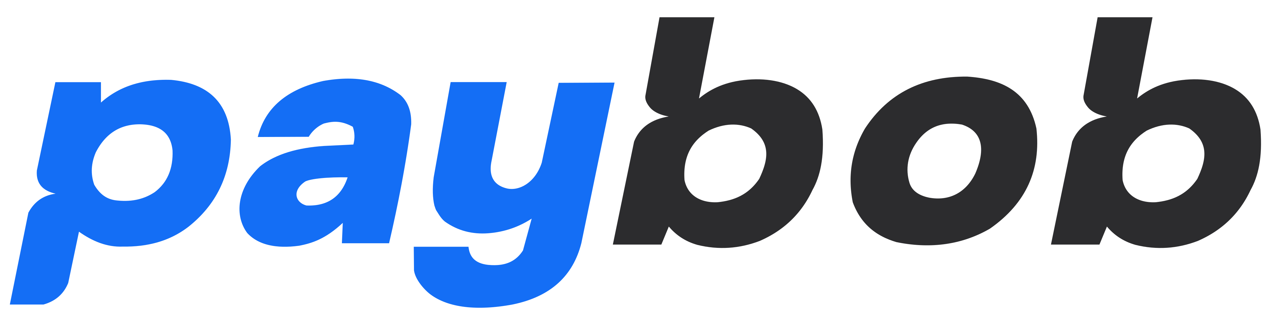
Primary logo
The default. Use on white and light backgrounds.

Logo on dark
For black and very dark backgrounds.

White logo
One color, for Paybob blue, photos and other colored backgrounds.

Mark
The “p” on its own, for small spaces where the full logo won't fit.


Circle icon
For round avatars, such as social profiles and chat apps.

Colors
Paybob Blue leads. Pair it with plenty of white, and Ink for text and dark areas.
- Paybob Blue#146EF5RGB 20, 110, 245
Primary. Buttons, links, highlights and the “pay” in our logo.
- Deep Blue#0B46D0RGB 11, 70, 208
Gradients and hover states with Paybob Blue.
- Graphite#2C2C2ERGB 44, 44, 46
The “bob” in our logo on light backgrounds.
- Ink#020617RGB 2, 6, 23
Headings, body text and dark sections.
- Sky#A1C7FFRGB 161, 199, 255
Soft accents and illustration gradients.
- Mist#F2F7FFRGB 242, 247, 255
Light backgrounds and panels.
Typography
Two free typefaces. Use semibold for headlines and regular for text.
- Plus Jakarta SansPrimary typeface: headlines, interface and most text.Get font ↗AaPayments that confirm themselves.ABCDEFGHIJKLM abcdefghijklm 0123456789
- Regular 400
- Medium 500
- Semibold 600
- Bold 700
- GeistSupporting typeface: longer body copy and product details.Get font ↗AaPayments that confirm themselves.ABCDEFGHIJKLM abcdefghijklm 0123456789
- Regular 400
- Medium 500
- Semibold 600
Usage guidelines
A few simple rules keep the brand clear and consistent.
Do
- Use the original logo files from this page.
- Leave clear space around the logo, at least half its height on every side.
- Keep the logo at least 24px tall on screen (16mm in print).
- Use the white logo on Paybob Blue, photos and other colored backgrounds.
- Write the name as “Paybob” in text, with a capital P.
Don't
- Don't recolor, outline or add effects such as shadows or glows to the logo.
- Don't stretch, squash, rotate or crop it.
- Don't rebuild the logo in another typeface or rearrange its parts.
- Don't place it on busy backgrounds where it's hard to read.
- Don't write the name as “PayBob”, “Pay Bob” or “PAYBOB”, or use the logo as a word in a sentence.
Paybob and the Paybob logo are trademarks of Paybob. Using them doesn't imply partnership or endorsement. For co-marketing, press or anything not covered here, get in touch first.
Contact us